
TABLE OF CONTENTS
A family member is sitting in a hospital waiting room, phone in hand, trying to find home care for a parent who may be discharged in two days. They open your website and ask a few questions almost immediately: Do you provide the care we need? Do you serve our area? Can I trust you? How do I talk to someone?
If those answers are hard to find, the family usually does not keep studying the site. They go back to search and open another agency. That is why a home care website should be built as a conversion system, not just a digital brochure.
The website is one part of a broader home care marketing system. SEO, paid search, local visibility, intake, and the website all have to connect. If you are paying for search traffic, our Google Ads for Home Care Agencies setup guide covers the traffic side. This guide focuses on what happens after the click and how to turn more of the right visitors into qualified care inquiries.
What Actually Makes a Home Care Website Convert?
A converting home care website is built around the family decision. Every major page should quickly answer four questions: what care you provide, where you provide it, why the family should trust you, and what they should do next.
Many agency websites make visitors work for those answers. Services are buried under vague navigation. Phone numbers disappear on mobile. Recruiting competes with family inquiries. Location information is unclear, and forms ask for too much before a family has spoken with anyone.
The fix is usually not more copy. It is a clearer path to a real conversation with intake.
Measure your own baseline before chasing benchmarks
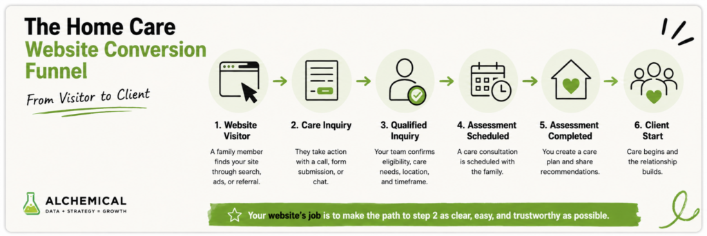
Instead of comparing your site with a generic industry conversion-rate average, establish a baseline using your own analytics and intake data. Track how many website visitors become care inquiries, how many inquiries are qualified, how many schedule an assessment, and how many eventually start care.
A useful website-to-client funnel looks like this:
● Website visit
● Care inquiry
● Qualified inquiry
● Assessment scheduled
● Assessment completed
● Client start
A site can generate plenty of form submissions and still underperform when the inquiries are outside the service area, employment-related, or otherwise unqualified. Qualified outcomes matter more than raw form volume.
Build Trust Before Asking for the Call
Families choosing home care are deciding who may enter a parent’s home during a stressful period. The website has to reduce uncertainty quickly without overwhelming them with badges, claims, or company history.
Use proof that feels real
Useful trust signals can include applicable licensing information, years in operation, real team photos, leadership bios, caregiver-screening standards, service-area details, and genuine reviews. Specific proof usually tells a family more than a broad claim such as “trusted care.”
Testimonials should also be specific enough to feel credible, but privacy still matters. Use identifiable care details, caregiver names, photos, or family stories only with appropriate permission and privacy review. A strong testimonial can explain the situation and outcome without exposing information that should remain private.
Put trust near the decision point
Place a few strong proof elements near the primary call to action, then repeat relevant trust signals on service and location pages. Someone landing directly on a dementia care page may never visit the homepage first.
A practical trust strip might show a real Google rating and review count, years serving the community, an applicable license or accreditation, and a short statement about caregiver screening. Only use proof you can verify.
Design the Homepage Around One Clear Next Step
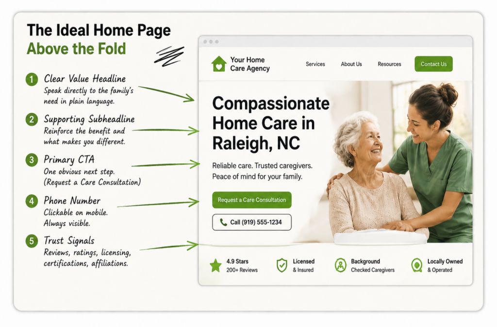
The top of the homepage should confirm relevance fast. A strong default is a headline that explains the service and geography, followed by a short line that speaks to the family’s situation.
For example, “In-Home Senior Care in [City] and Surrounding Areas” is more useful than a broad headline such as “Compassionate Care You Can Trust.” The first version immediately tells the family whether they are in the right place.
A homepage structure you can hand to a developer
Use this as a practical starting order. It is not the only layout that can work, but it gives the page a clear conversion path.
1. Header: Logo, primary phone number, a clear care-inquiry action, and a separate Careers link. Keep recruiting visible without letting it compete with the family path.
2. Hero: State the care service and service area in the H1. Add one short supporting line, one visually dominant care CTA, and an obvious phone option.
3. Trust strip: Place three or four verifiable proof points directly under the hero, such as a real review rating, years in business, licensing information, or caregiver-screening standards.
4. Core services: Show the main care types families actually search for, such as personal care, dementia care, respite care, overnight care, or 24-hour care. Link each service to a useful dedicated page.
5. How care starts: Explain the next steps in plain language. A simple sequence such as Talk with our team, Build the care plan, Start care removes uncertainty.
6. Proof and people: Add specific testimonials, real caregiver or leadership photos, and short bios that help families understand who they may be trusting.
7. Service area: Name the real cities, counties, or communities the agency serves and link to useful location content where appropriate.
8. Final conversion section: Repeat the primary next step near the bottom of the page with the phone number and short form. Do not make the family scroll back to the top to contact you.
Use one visually dominant action
Give the page one visually dominant next step, such as “Request a Care Consultation” or “Check Care Availability.” Keep the phone number obvious for families who prefer to call immediately, but do not make every action compete for equal attention.
On mobile, a visitor should not need to scroll through company history, recruiting content, and multiple service blocks before finding a way to speak with the agency.
Reduce form friction without removing useful qualification
The right form is not simply the shortest possible form. It asks for the minimum information your intake team needs to start a useful conversation. A strong starting form for many agencies is:
● Name
● Phone number or preferred contact method
● ZIP code or service area
● Type of care needed
● When care is needed
Email can be added when it supports the follow-up process. Avoid asking a stressed family to complete a full intake questionnaire, medical history, or detailed payment information before anyone has spoken with them. Save deeper qualification for the appropriate next step.
After submission, confirm that the inquiry went through and explain what happens next. That reassurance matters when the family may be contacting several agencies.
Separate Family Inquiries From Caregiver Applications
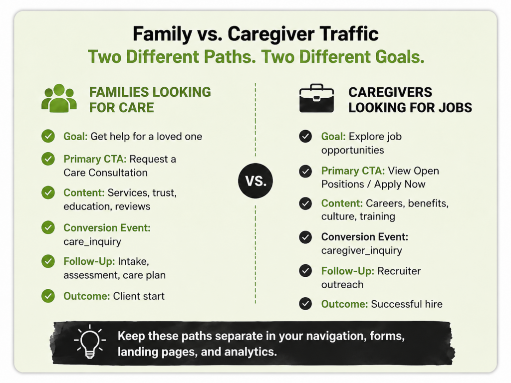
Home care websites serve two very different audiences: families looking for care and caregivers looking for work. Sharing the same forms, navigation, and conversion tracking makes the experience and the marketing data less reliable.
Create a clear Find Care path for prospective clients and a separate Careers path for job seekers. Use different forms, confirmation pages, phone tracking where appropriate, and conversion events so employment inquiries are not counted as marketing leads.
This distinction matters even more when paid search is involved. Our guide to cutting Google Ads waste for home care agencies explains how job-seeker traffic and weak conversion signals can make an account look healthier than it really is.
Make Mobile Performance and Accessibility Non-Negotiable
Families will reach your website from phones, tablets, and desktops, often during an urgent care decision. Check your own device mix in GA4, but make sure the critical conversion path works cleanly on a phone.
Use current performance metrics, not a single PageSpeed score
PageSpeed Insights is useful, but a Lighthouse performance score should not become the only target. Google recommends good Core Web Vitals, including a Largest Contentful Paint within 2.5 seconds, Interaction to Next Paint under 200 milliseconds, and Cumulative Layout Shift under 0.1. Review both field data and lab diagnostics when improving performance. See Google’s Core Web Vitals guidance for the current definitions.
In practice, compress oversized images, remove unnecessary scripts, prevent layout shifts, and test forms and phone links on real mobile devices. Do not stop at a green score. Complete the same actions a family would complete.
Accessibility also improves basic usability
Accessibility should be part of the build, not a cleanup project after launch. Use readable text contrast, descriptive alternative text for meaningful images, keyboard-accessible controls, clear form labels, visible focus states, and tap targets that are large enough to use comfortably.
That matters for a service used by older adults, family caregivers, and people with different levels of vision, mobility, or technical comfort.
Build Useful Service-Area Pages, Not Doorway Pages
Home care is local, so families need to understand where the agency actually provides care. Dedicated location pages can help when they provide real value, but “one city, one page” is not an automatic rule.
Google’s spam policies warn against creating substantially similar city or regional pages that funnel visitors to the same destination. A page should exist because it helps families in that market, not because a city name can be swapped into a template. Review Google’s doorway abuse guidance before scaling location content.
A useful location page needs more than a city name
When a dedicated page makes sense, give it information a family in that market can actually use. A strong location-page framework can include:
● A unique H1 that names the service and location naturally
● A short opening that explains who the agency helps in that market
● The care services actually available there
● Specific communities or neighborhoods covered when useful
● How consultations, assessments, and care starts work
● Genuine local proof, partners, resources, or operational details when available
● Questions families in that market commonly ask
● A clear care-inquiry CTA and links to the relevant service pages
For smaller service territories, one strong service-area hub may be more useful than dozens of thin city pages. Our Home Care Local SEO guide goes deeper into location pages, Google Business Profile, reviews, citations, and local authority.
Be careful with LocalBusiness schema
A city you serve is not automatically another business location. Google’s LocalBusiness structured-data guidance defines each actual local business location as a LocalBusiness and requires a physical address for Google-supported LocalBusiness markup. Do not create a separate LocalBusiness entity for every service city simply to target that market. Use structured data that accurately represents the real organization and real locations. See Google’s LocalBusiness structured-data documentation for current requirements.
Track the Path From Website Visit to Client Start
The website is only one part of the acquisition system. Connect website tracking with intake outcomes so you can see which pages and traffic sources create real business opportunities.
At minimum, keep the major stages separate in analytics or your CRM. Suggested event names can be as simple as:
● care_inquiry
● qualified_lead
● assessment_booked
● client_start
Then report by source and landing page. A service page that creates ten form fills but no qualified assessments should not be treated as a stronger page than one that creates four inquiries and two new clients.
Useful website and intake metrics include:
● Qualified care inquiries by page and traffic source
● Call-answer and response-time performance
● Inquiry-to-assessment rate
● Assessment-to-client-start rate
● Client acquisition cost when paid media is involved
● Weekly care hours or revenue generated from new clients
This is also where a structured Home Care Marketing Audit becomes useful. Traffic, SEO, paid media, website conversion, and intake performance should be evaluated together because a problem in one part of the system can make another channel look worse than it really is.
Run This 10-Minute Home Care Website Conversion Test
You can find several high-impact problems without opening an analytics platform. Run this test on your phone as if you were a family member who had never heard of the agency.
1. Open the homepage on your phone. Without scrolling, can you tell what care the agency provides and where?
2. Can you call the agency with one tap?
3. Is there one obvious next step for a family looking for care?
4. Is the Careers path clearly separate from the Find Care path?
5. Can you see at least one genuine trust signal before you have to hunt for it?
6. Submit the care-inquiry form yourself. Does it work cleanly on mobile?
7. After submitting, does the site confirm the inquiry and explain what happens next?
8. Open one major service page. Does it answer the questions a family would have about that specific care need?
9. Open a location page or service-area section. Is it genuinely useful, or is it mostly a city name repeated around generic copy?
10. Ask one final question: could a stressed adult child understand why to trust this agency and how to start care without exploring the entire website?
Every “no” gives you a concrete improvement to make. When the problems appear across several steps, the issue is usually structural rather than cosmetic.
When to Fix the Existing Site and When to Rebuild
You do not need a full redesign every time conversion performance is weak. If the site is technically sound, focused fixes to navigation, service pages, forms, mobile experience, internal linking, and tracking may solve the biggest problems.
A rebuild becomes more reasonable when the platform limits performance, mobile layouts are difficult to repair, the architecture does not support services and locations cleanly, tracking is unreliable, caregiver and family funnels cannot be separated, or accessibility issues are widespread.
Our web design and development work is built around that full path from search to inquiry, not visual design in isolation. The right solution may be a focused set of fixes or a new site architecture. The data should tell you which one.
Frequently Asked Questions
What should be above the fold on a home care homepage?
Start with a clear service-and-location headline, a short supporting message, one visually dominant care-inquiry CTA, an obvious phone number, and credible trust signals. The visitor should understand what you do and how to contact you without searching the page.
How long should a home care inquiry form be?
There is no universal field count. Ask for the minimum information intake needs to begin a useful conversation. Name, contact information, service area, care need, and timeframe are a practical starting point for many agencies. Then test form completion and lead quality using your own data.
Does a home care agency need a location page for every city it serves?
No. Create a dedicated page when the agency genuinely serves the area and can provide useful, differentiated local information. Avoid mass-producing substantially similar city pages. A strong service-area hub may be better for a smaller territory.
How do you know whether a home care website is converting well?
Measure the full path, not just form submissions. Track qualified care inquiries, assessments, client starts, and the revenue or care hours those clients generate. Compare changes against your own baseline and by traffic source.
Should caregiver recruiting live on the same website?
It can, but recruiting should have a clearly separate path. Use distinct navigation, forms, landing pages, and conversion tracking so caregiver applicants do not compete with family inquiries or distort marketing reports.
Start With the Biggest Conversion Gap
A home care website does not need to be complicated. It needs to help the right family understand the service, trust the agency, and take the next step without unnecessary friction.
Start with the 10-minute test above. Fix the largest gap first, whether that is unclear messaging, weak trust signals, a confusing form, mixed caregiver traffic, poor mobile performance, thin service-area content, or broken tracking. Then measure what changes in qualified inquiries and assessments.
The broader goal is the same across every channel: make it easier for high-intent families to find the agency and become real care opportunities. A Home Care Growth Audit reviews the website alongside SEO, Local SEO, Google Ads, AI search visibility, and conversion tracking so the biggest gaps can be prioritized first.